Role: UX/UI Designer
Duration: 7 months
Responsibilities: Designing & maintaining Design System from scratch
Teamates: One other UX Designer, Product Manager, Product Owner
Results
Successfully implemented design system from Figma to code
Established governance team to oversee the design systems evolution
Design System utilized for multiple brands streamlining components ( Boost Mobile and Boost Infinite)
Software teams save
2,000
hours in dev & design time per component
Efficiency improvement in individual component implementation
80%
IBM Cloud Platform case study, 2020
Design Systems increase speed to market
28%
Business Case for Design Systems, Fathom Analytics, 2018
Efficiency savings for front-end development
47%
ROI Impact of Design Systems, Sparkbox, 2021
What is a Design System?
A design system is an accelerator to create better experiences while saving time and money through a set of guidelines that help make your work easier and faster. It is made of several components such as colors, text, buttons, icons, ect.
A design system is meant to serve as a foundation that supports both designers, developers, as well as everyone involved in a particular project.
A design system should be purposely simple, scalable and adaptable to design needs.
A Design System is a critical central source of truth, and all the resources necessary to deliver consistently and efficiently.
A Design System is an accelerator to create better experiences while saving time & money.
A Design System includes…
Reusable components and resources
A defined brand expression and design principles
Global patterns and flows
A governance model for current and future growth
Reusable design resources and usage guidance
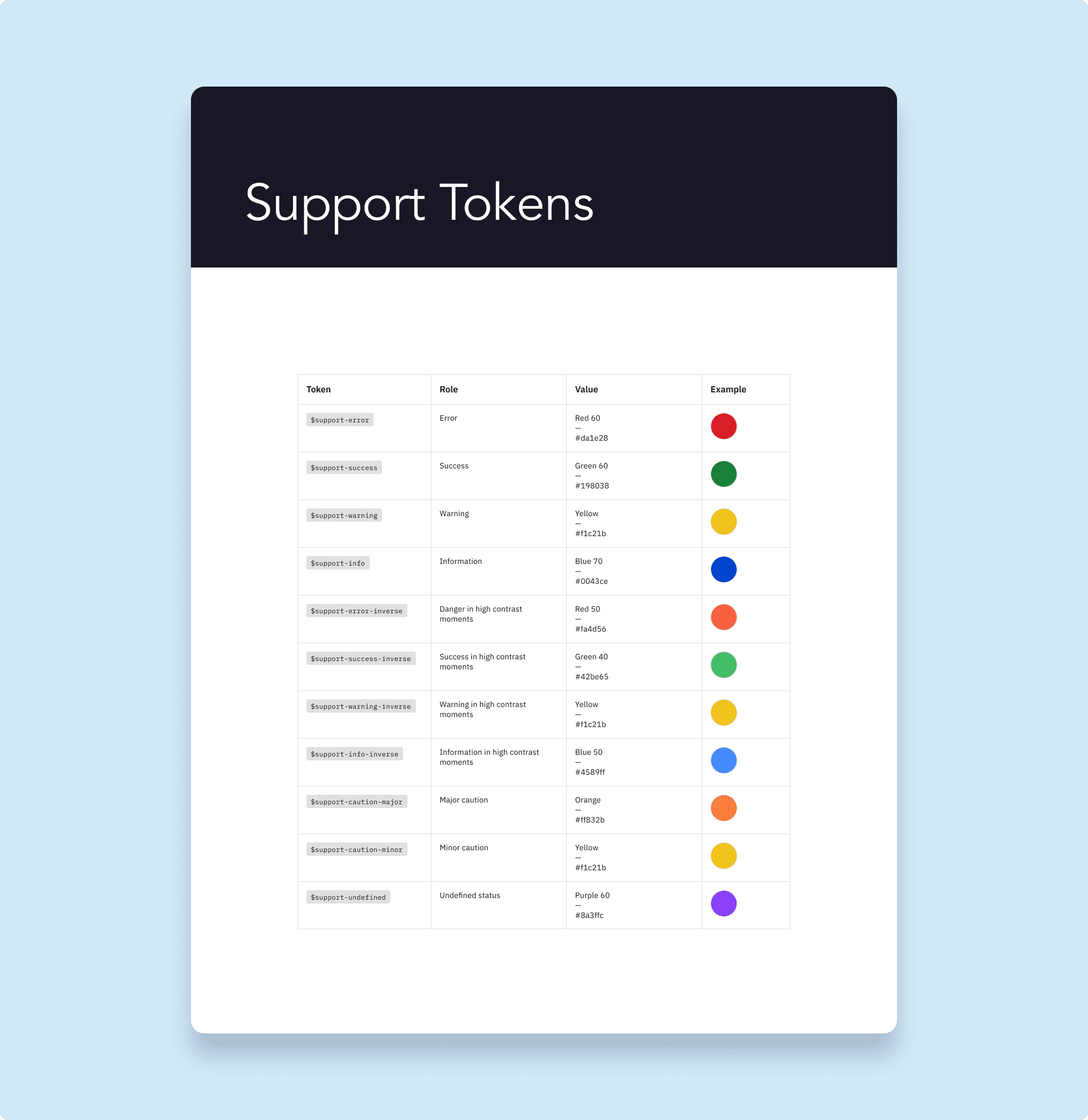
Theme File
Before getting into the design system, one level below is the Theme file. All of the components used in the design system are pulling information that help create, mold, and better inform the design system UI elements are set up such as spacing, colors, typography, ect.
The theme file utilizes:
Shapes
Color Spectrum
Color
Typography
Effects
Spacer
Screens
Utilities
Atom Methodology
The Atomic Design approach to our Design System. Atomic design is a methodology composed of distinct stages working together to create interface design systems in a more deliberate and hierarchical manner. The stages of atomic design are:
Atoms
Molecules
Templates
Pages
Atomic design is not a linear process, but rather a mental model to help us think of our user interfaces as both a cohesive whole and a collection of parts at the same time. Each of the stages plays a key role in the hierarchy of the interface design system.
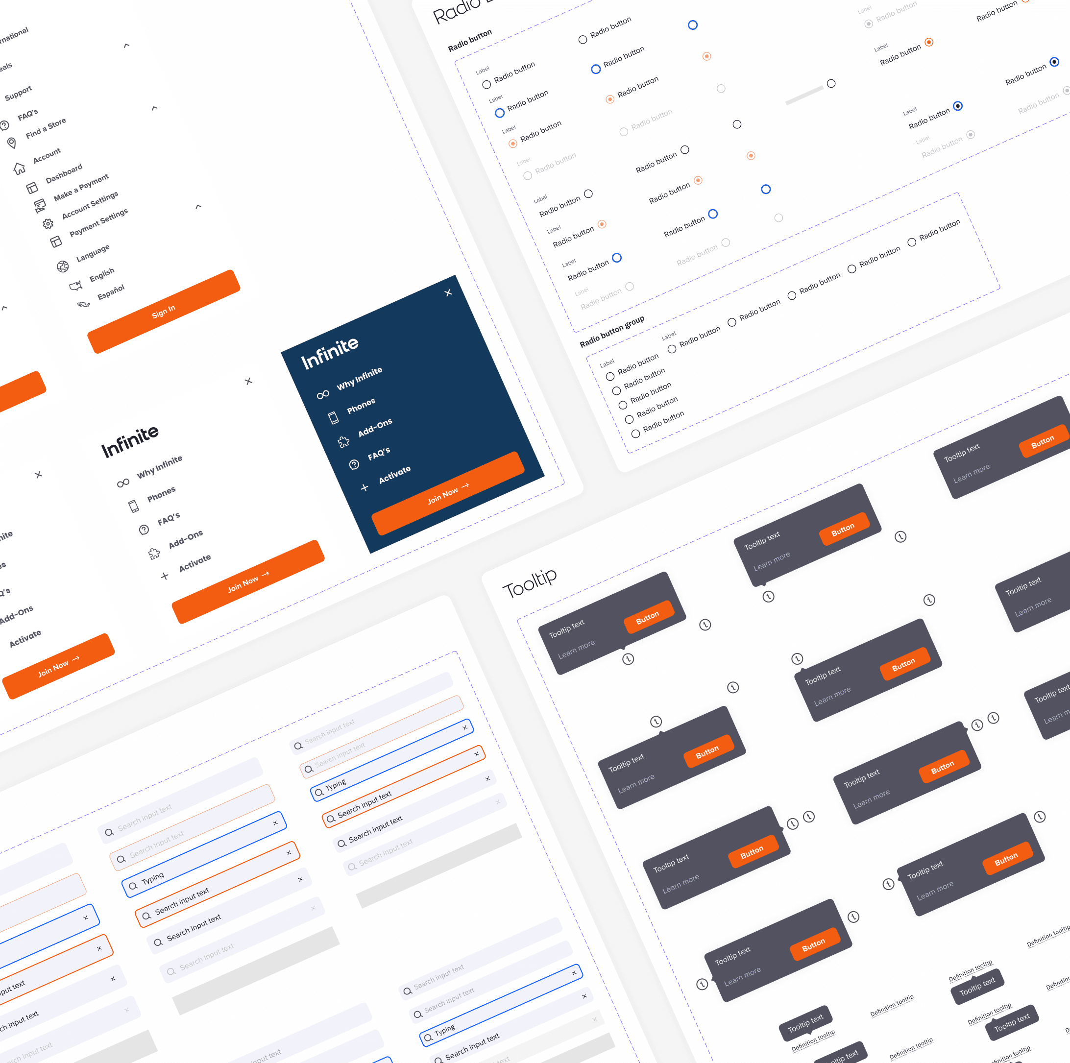
Atoms
Atoms represent the most basic interface elements, they are the basic building blocks. They’re the foundation and supporting structure of an interface. Some examples include: Buttons, Checkbox, Tooltip, Pagination etc. Consider them like lego pieces, there’s no way to break atoms down any further.

Molecules
Molecules are groups of atoms bonded together that have their own unique features. They take simple design features and pair them together as a more complete and cohesive UI element. They are concrete and reusable components. Through Molecules, you are starting to build out the page and create more purpose.
Breaking things down at the Molecules level makes testing easier, encourages reusability, and promotes consistency throughout the interface.
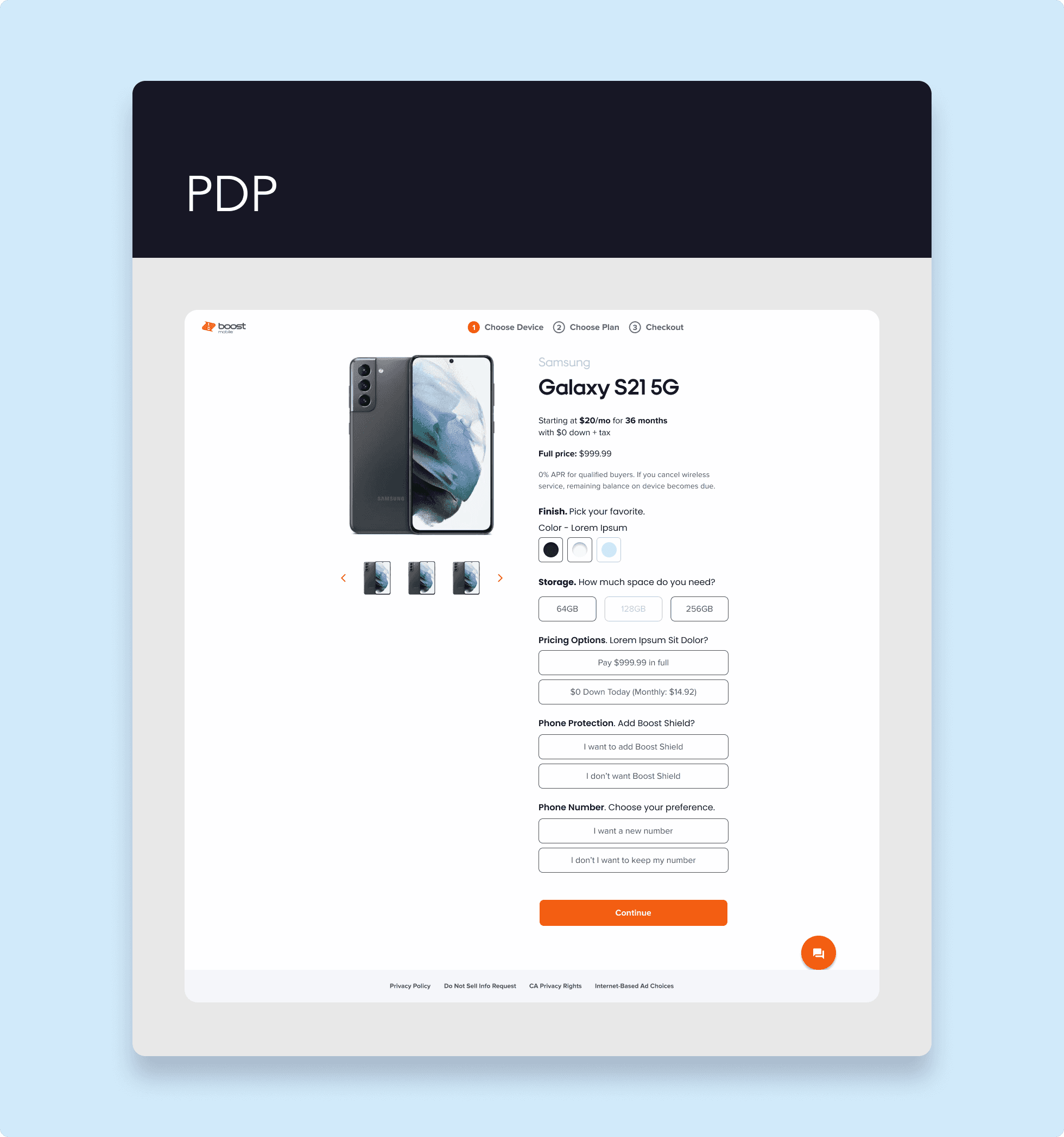
Templates
Templates are page-level objects that place components into a layout and articulate the design’s underlying content structure.
A template displays all the necessary page components functioning together, which provides context for these relatively abstract molecules and atoms. When crafting an effective design system, it’s critical to demonstrate how components look and function together in the context of a layout to prove the parts add up to a well-functioning whole.
Another important characteristic of templates is that they focus on the page’s underlying content structure rather than the page’s final content. Design systems must account for the dynamic nature of content, so it’s very helpful to articulate important properties of components like image sizes and character lengths for headings and text passages.
The Slot components technique is a simple but powerful method that adds extra flexibility to your design system. If designed well, no one will have a need to detach components.
Slot Modeling helps deliver solutions more quickly: This technique allows solutions to be delivered in a short amount of time and designers can create custom components to swap with the slots.
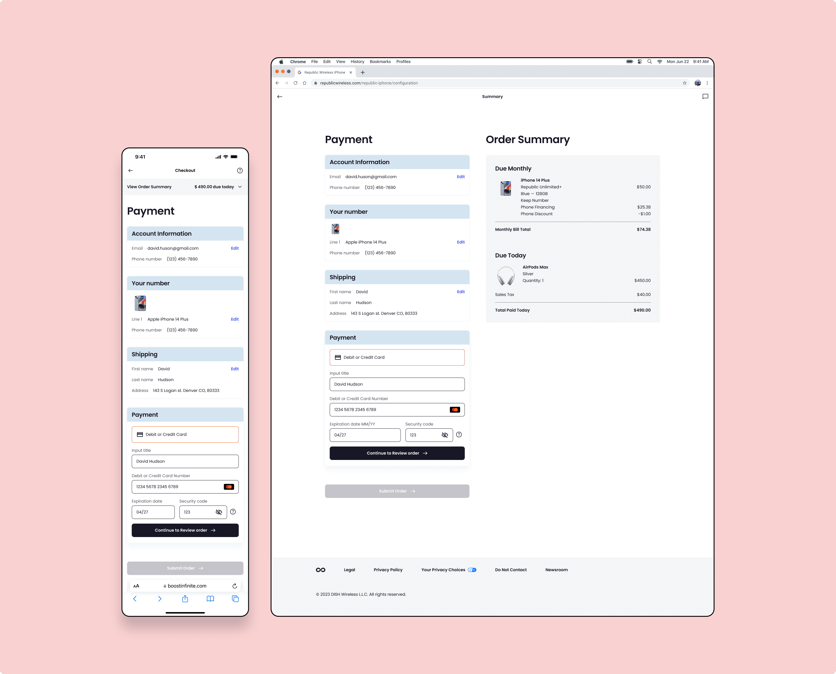
Pages
Here is when we take those wireframes and build on them. It’s time to add all the final details. Templates are gradually removed to make way for actual pages that people may interact with.
This is what users will see and interact with when they visit the screen. This is what your stakeholders sign off on. And this is where you see all those components coming together to form a user interface. In addition to demonstrating the final interface as your users will see it, pages are essential for testing the effectiveness of the underlying design system.
It is at the page stage that we’re able to take a look at how all those patterns hold up when real content is applied to the design system.
Does everything look great and function as it should? If the answer is no, then we can loop back and modify our molecules, organisms, and templates to better address our content’s needs.
Final Thoughts
It’s one thing to utilize and follow the rules of a design system, but it was an amazing experience to be a part of designing the system it’s self from the ground up and to be part of the team that vouched for the importance of the system at the grass roots level.