Role: UX/UI Designer
Duration: 4 months
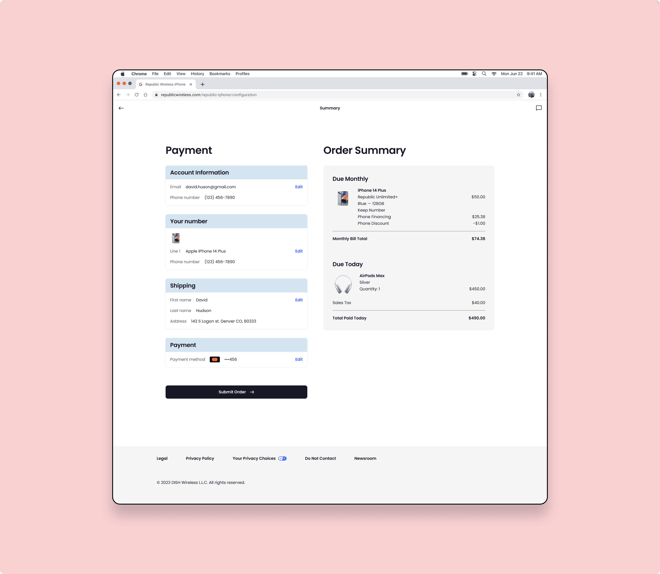
Deliverable: A redesigned checkout experience for Republic Wireless
Teamates: One other UX Designer, Product Manager, two Developers
SUMMARY
Based on Salesforce Commerce Cloud, Republic Wireless’s legacy checkout was dated and needed updates that would break all the customizations made in the past. This also represented an opportunity to improve an experience that had bugs, was slow, full of unnecessary steps, and confusing. As according to Scandiweb, on average, 75.8% of customers abandon their carts due to one or more of these issues, so the potential was not only to be able to have the latest version running but also improve our conversion and reduce cart abandonment.
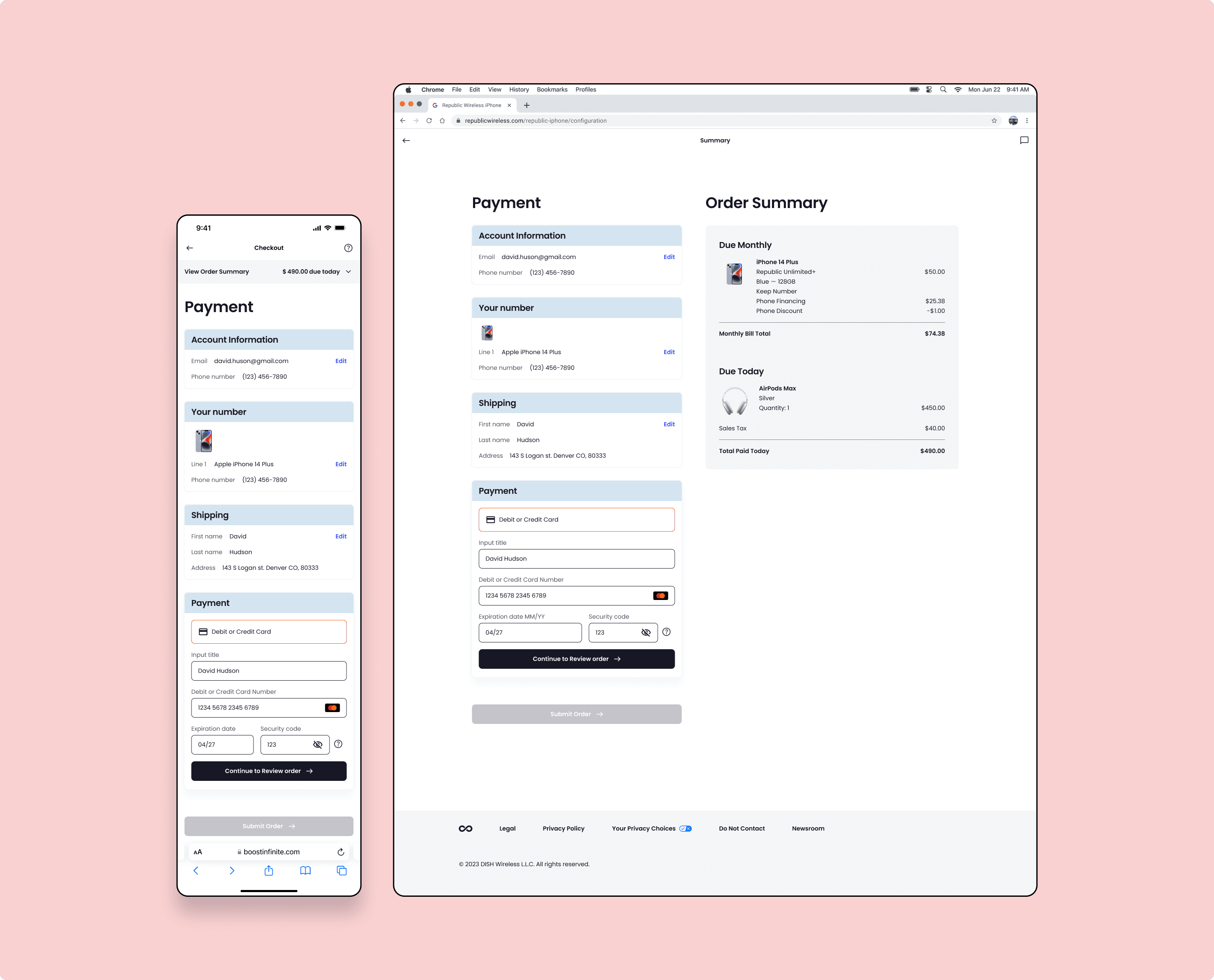
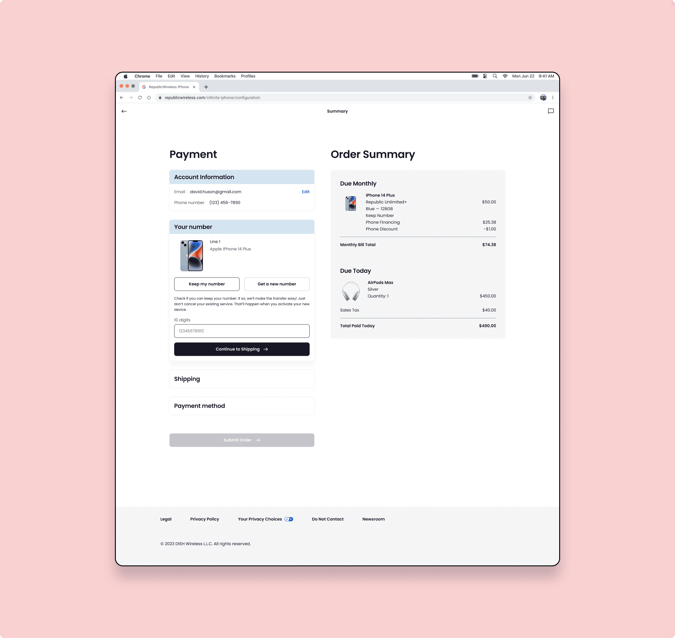
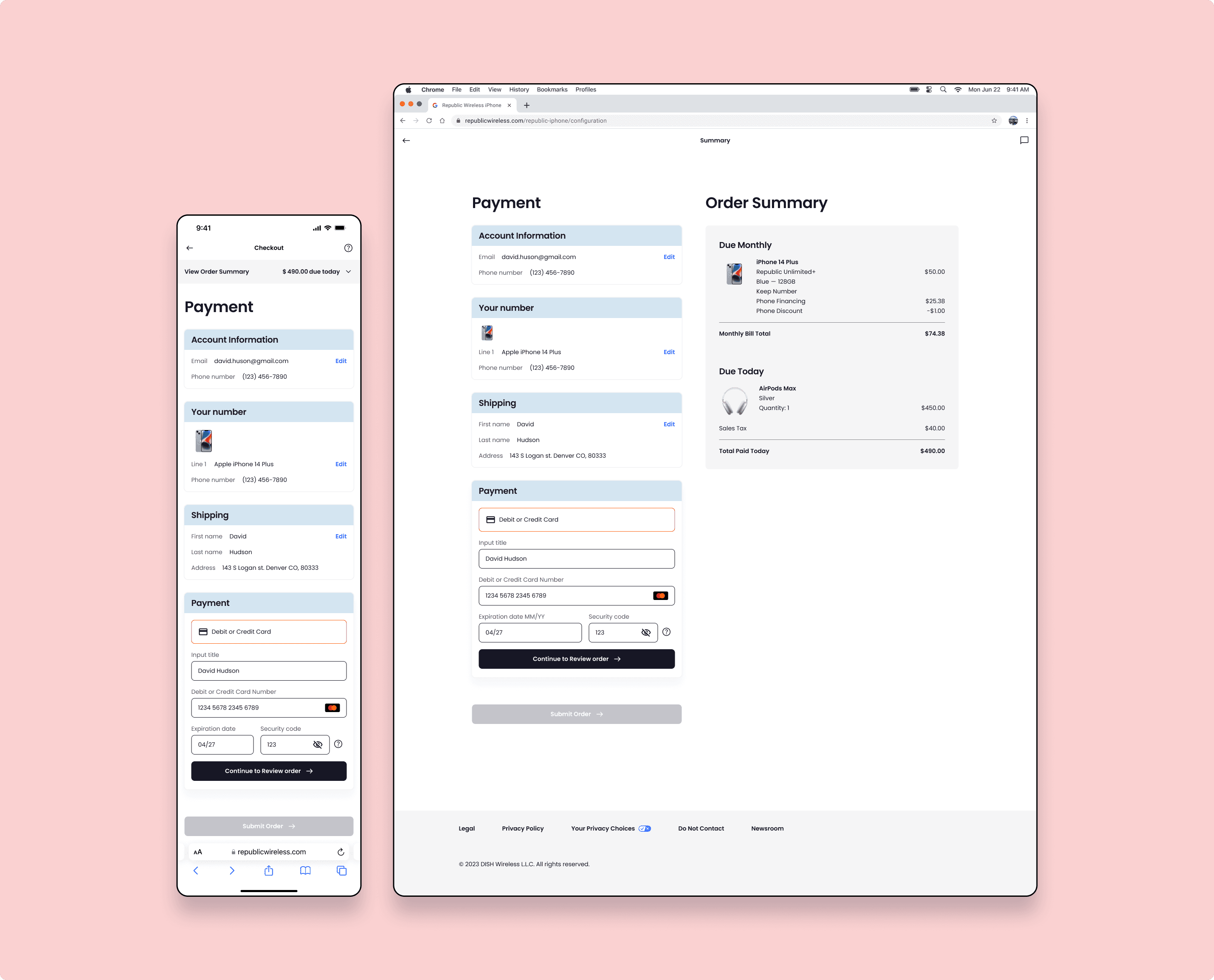
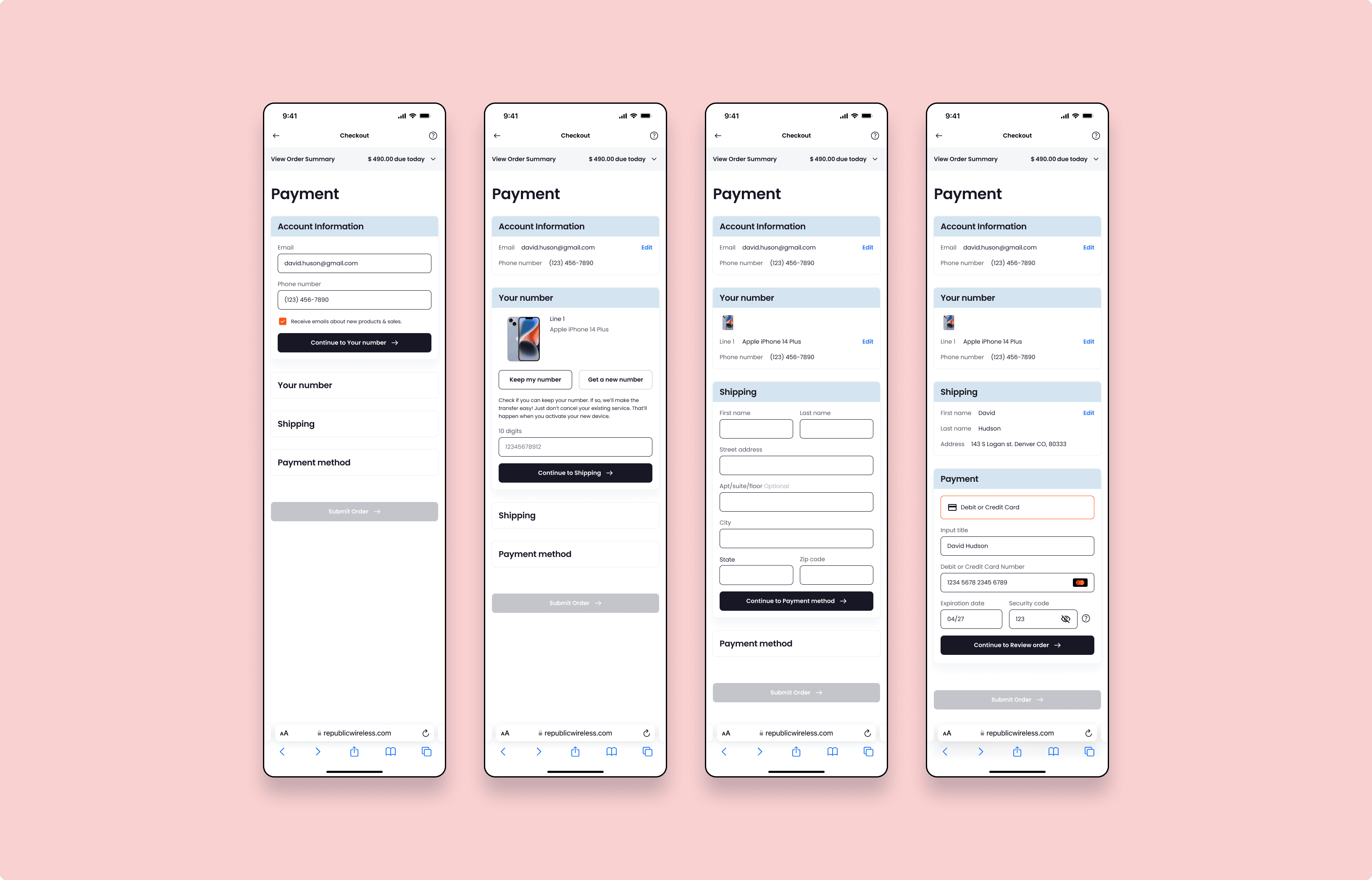
Before designing anything we started looking at competitors and capturing the flows for checkout. Knowing that the checkout process is something common across all e-commerce sites, we didn't want to reinvent the wheel. But if their was a flow that seemed to be much more successful over others, we had the ability to pivot and switch to that flow. So we started by taking a look at the landscape. We looked at over 10+ e-commerce websites, and noticed two recurring design patterns: Accordion and 2-Step Checkout.
Accordion is the type of checkout that has all the steps in one page with each of them expanding as the user fills the previous one. The advantages are that Accordion-type checkouts are compact, you can have same-page edits (no need for browsing back) and it’s the closest to the Salesforce Commerce Cloud out of the box solution. Some of the brands using it that we deeply analyzed are AT&T, T-Mobile, Nike & Adidas.

This type of checkout divides the flow into two separate screens. While that visually helps customers understand where they are in the checkout process using a progress bar, it does present some challenges. For instance, if the user wants to review or edit entered information, they have to return to the previous page, causing extra loading times and data loss. Also, the form can be perceived as complicated and longer for some users. For our case, this type of checkout was further away from the out of the box solution from Salesforce Commerce Cloud. Brands like Verizon, Cricket Wireless, and Vans- all using Shopify- were using this type of checkout.


Although there was not evidence that one checkout was better than the other, we decided to opt for the accordion type of checkout given the observed trend of more E-commerce brands using this design style. It also made sense considering the out of the box solution from Sales Force was set up for an accordion style checkout.
As a team we learned a lot on how to work together cross functionally towards a common goal, offering each other constructive feedback and iterating a lot rather than designing too much before passing over to developers.
We observed an improved conversion rate of 21% comparing the same period year over year. Considering 2021’s traffic and average order value, this could be translated to an early positive impact of over $340k in yearly revenue.
